Back to [Archive] Withdrawn submissions

[ODP] An update on the narrowing of the black-white gap in the Wordsum
Admin
Maybe a little bit, but at the same time, you requested a lot of very unreasonable things.

I said : "my R syntax maybe is not "elegant" to you, but produce correct results".

You said : "no it's bad I don't like it, and it's error prone, so you should modify it".

I respond : "your answer sound like you suspect me having made errors in typing the numbers; if so, check the numbers by yourself rather than continuing saying that the syntax is wrongdoing and bad".

It's not an exaggeration to say this whole discussion is pointless, and time-wasting. And I don't really want to waste time on something like this. Normally, these advices should be given elsewhere, e.g. "Other Discussions".


I did find an error in your code which affected the results. The error was directly caused by bad coding practices (hard-coding a variable instead of dynamically calculating the value). It is not unreasonable to insist on a good coding practice in that case. Others may want to re-do your analysis later, e.g. when more data becomes available. Or simply because they do not trust that you did correctly. Or because they want to apply the same analysis to a different dataset.

Another weird request is the figures. When I make a request about the shape and presentation of the article, it's not based on whether I like it or not. The way you usually cite references (i.e., [1], [2], [3] etc. instead of Kirkegaard et al. (2014) etc.) in all of your papers is very annoying to me, but I never said anything about it, because as I said, it's subjective, so it should not be a requirement. On the other hand, if I think the tables and figures would make problems for the credibility of the journal (e.g., using screenshot from blogpost) I will probably say it and it is a reasonable request. But concerning where I should put my figures, I decided this based on a certain logic : I never saw someone else doing as you requested. Either figures+tables are included within the text, or at the very end of the paper. The only reason you have given is because the figures are more important. I wonder in what way. Figure 8 and table 9 are equally important. Figure 8 only plots the parameter estimates given in table 9, where the depiction of the BW gap changes is already, and clearly visible (see column "Coeff. β1j").


You would do well to quote me, as I gave an explicit reason for this.

The figures are still not placed in the text. This means that the reader has to jump back and forth between the end of the paper and the text. You should move them up so they are near the text wherein they are discussed.


Since it apparently is so important to you, I will not hold my approval based on the placement of the figures. I will however not approve if the code syntax is placed in the paper instead of in the supplementary material.

You also said things that are very contradictional. Such as that we cannot tell from histogram if the distribution is normal or not. If it weren't you, I would say you're joking and try to play with my mind. In your blog post here, for example, you always accompany each Shapiro-Wilk test with histogram. Why, if you don't need histograms ? The reason is because you can't understand the numbers without graphical representations. I said it many times but you keep saying this. I have also the feeling you know you're wrong, but won't admit it. Otherwise, you wouldn't use graphs with SW test. The only reason why we can guess the extent of the non-normality with SW test is only because we had graphical representations about what a W value of <0.90, 0.95 or >0.99 might be. In fact, SW cannot be understood without histogram, but you don't need SW to understand a histogram. A single number like this is too abstract and it's not possible to understand the shape of the distribution of your data.


(You're looking for the word "contradictory".)

I did of course not say what you claim I said. It is a straw man. What I actually wrote is:

There is nothing wrong with the .99 guide. Your judgments based on Q-Q plots do not show much. Subjective judgments are bad in science (and everywhere else). If there is an objective way, use that instead.

Yes, there is deviation from normal. That is what W shows. Why are we disagreeing about? First you say .99 doesn't work even for large datasets. Then you agree that the two variables with .94-.95 show small to modest deviation from normality. Which way is it?


To recap again: Interpretation of histograms and QQ-plots is subjective. The SW value is objective (does not require any judgement call). As such, to decide whether or not normality is violated for a given sample, it is best to rely on an objective measure because for that reason there can be no disagreement. Of course, there can be disagreement about how to interpret the value of the SW test, but not the value itself. For large datasets (5k in my tests), W>.99 is a reasonable guide for normality.

Interpreting and using p-values from SW test is another matter, and I know that you like to criticize typical null hypothesis testing statistics. Perhaps read a textbook on Bayesian statistics and see if you like that more.

---

Quotes from previous posts.

Everything is wrong, if I can prove you I can get normal distribution with <0.99 W value. And I did.


You did not supply any normal distribution with <.99 W. You supplied various distributions clearly deviating from normal with W's <.99.

You even knew that the "universal" p-value cut off of 0.05 is arbitrary, but you are ready to believe that your value of W=0.99 is universal ? Probably not. Then, your guide is equally subjective. But if you don't believe W=0.99 is universal, why are you telling me that subjective judgments on QQ/histogram are bad ? It cannot be worse than using your guide, which would certainly prove most dangerous for me. Most researchers, if not all, would kill me if they learn that I use a rule applied to a statistic that has been recommended by someone who did not publish his paper on a peer-reviewed article. For a cut-off value of 0.99 so important in stats, it's clear that nobody will accept your judgment if it can't pass the peer-review. So, I have every reason to think that your suggestion to cite your blog post and follow your cut-off is extremely dangerous. And not a reasonable request.


If you quote a value as a guideline, cite something for it. I don't care if you cite my blog in particular. If you can find other useful simulations or expert advice, cite that.

I don't know how many times I should repeat it. Your comment assume you don't trust me, that is, you think I must have necessarily made a mistake somewhere. Why not rerun the syntax, if you want to see ? Like I've said, I examined the numbers many times before. Yes. Too many times.


I don't trust you to have done analyses correctly. It is not personal. I don't trust anyone to have done analyses correctly, including myself in previous studies (who has not found errors in their previous analyses when they looked through them at a later point?). Science must be open to scrutiny of the methods because everybody makes mistakes.

And it's not a bad code. Perhaps in a subjective way, but not in an objective way. A code is objectively "bad" or "wrong" only if it produces erroneous results. All of my results are correct.


Your results were slightly off as I already showed. It is bad code for the simply reason that you hard-coded a value instead of dynamically calculating it.

What do you mean by re-centering ? I centered, but I did not re-centered. I also don't understand "inputted values". If you mean imputed values, I didn't do anything like this. It seems you said it was the value 40.62 which was the problem. Once again, I said I'm not wrong. In my article, I said I have taken the mean age for people having wordsum score and I have also applied sampling weight for all of my analyses. See below :


"centering" or "re-centering" mean the same.

"inputted" is the past tense of "input", i.e. put in. Not imputation.

The value you wrote and used is wrong for the data you gave.

> mean(d$age)
[1] 41.47897


I am using your syntax and the data you supplied.

This is not what I did. What is the purpose of [,1] here ?

Anyway, you're just showing me that I was right about R. No, R doesn't rock, it sucks. When you request fitted() without [,1] you will actually get the weird plot I had before. Like I've said, R is annoying. It sucks when you have missing data. Even when you correct for missing data, you still have problem, because you need to know first that fitted() must be used in conjunction with [,1]. You knew that, but I didn't. You'll never, never, never have this sort of problems in other softwares, where the procedure is straightforward. But R is silly.


Your code was wrong. The fitted() function returns a 2-column object. You only want to use column 1 for the plot, so you need to only extract that.

This mistake was easy to find, one can simply use head(), View() or dim() on the fitted object to see that it had the incorrect number of columns for the plot function.

I did not know it beforehand, I simply investigated the error. Most programming is bug fixing.

You didn't pay any attention to my syntax. Remember :

entiredata<-read.csv("GSSsubset.csv")

It's csv, not sav file. This means I have already converted my sav into csv file. It has no problem of factor variables because everything in csv files is numerical.


I did pay attention. Your code does not work because the datafile you supplied is in SAV format. So, one either needs to alter the code to load the SAV file (I tried that, as noted), or convert the file to CSV (better).

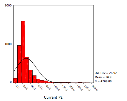
I left the best in the end. Try it several times. And if possible, try it many times. Now, I attach two graphs. sw1 and sw2. (EDIT : there is no title in the graphs. Anyway, sw1 is the graph on the left, attachment 577, and sw2 is on the right, attachment 578.) Most of the time, the above syntax generates something very to close sw1. But sometimes, you get something like sw2. You can tell by "eyeballing" that the two distributions are not alike. You will surely agree that most people can easily accept the sw1 as fairly normal, but you will surely also agree that most people won't accept the sw2 as normal, because of its high kurtosis.


The difference is caused because R has decided to use different numbers of breaks. This value is estimated from the data, so when you randomly generate data it sometimes arrives at another estimate. Specify the number to use in the hist() function. By my count, your left hist has 19 breaks while the right one has only 10. This gives the decidedly different look. It is just a visualization difference. In this case, it nicely illustrates my point because the difference changed your judgement regarding the normality even though it was about the same.

E.g. to run the code 1000 times:

shaps = numeric()
for (test in 1:1000){
x<-rnbinom(5000,7,.3)
#hist(x,breaks=50)
shap = shapiro.test(x)
shaps = c(shaps,shap$statistic)
}
sd(shaps)
mean(shaps)


> sd(shaps)
[1] 0.003181278
> mean(shaps)
[1] 0.9658063


So the W value is around .966. It fails the .99 guideline almost always (the highest value in my 1000 simulations was 0.9768483). Histograms with a proper number of breaks/bins show that it is decidedly non-normal (very long right tail, cut off left tail).

I attach as an example a few histograms with different numbers of breaks for the same data. (Note that the hist() function uses the breaks input as a suggestion and may fail to follow your advice. One can override this behavior if desired, but generally it is not necessary.)
It is not unreasonable to insist on a good coding practice in that case.


What is bad is to lie, i.e., pretending there is an error when the person know there is no error.

The figures are still not placed in the text. This means that the reader has to jump back and forth between the end of the paper and the text. You should move them up so they are near the text wherein they are discussed.


Once again, you ignore my questions. Why are you asking to move up the figures and not the tables ? The only possible reason is that you find the figures more important. You didn't answer me because you know it contradicts your opinion that graph are useless because of judgment call etc.

I will however not approve if the code syntax is placed in the paper instead of in the supplementary material.


Although I didn't say I would insist on that, this is an obscure request, as I see others doing this. But more important is that instead of doing this

d$wordsumpredictedage<-
5.210807+1.355356*d$bw1+-.0051079*d$agec+-.0016632*d$agec2+.000017*d$agec3+.0169752*d$bw1a
gec+.0002868*d$bw1agec2+.0000104*d$bw1agec3


You can do this

d$wordsumpredictedage<-
5.210807+1.355356*d$bw1+-.0051079*d$agec+-.0016632*d$agec2+.000017*d$agec3+.0169752*d$bw1agec+
.0002868*d$bw1agec2+.0000104*d$bw1agec3


And it will work properly even copy pasting from a pdf. But I'm sure you already knew this.

I did of course not say what you claim I said. It is a straw man. What I actually wrote is:

There is nothing wrong with the .99 guide. Your judgments based on Q-Q plots do not show much. Subjective judgments are bad in science (and everywhere else). If there is an objective way, use that instead.


You again ignore my comments. I said that histogram and QQ plot show no strong deviation from normality and in response you wrote "Your judgments based on Q-Q plots do not show much. Subjective judgments are bad in science". And my response was that your answer is nonsense because it necessarily means that you implied that I cannot say that this distribution here is non-normal and that distribution here is normal. By this, you are implying that people cannot read a graph. But everyone can tell the huge difference with high accuracy. I insist on accuracy because you missed that several times. And even your opinion that SW test is an objective test is wrong and contradicted by several of your earlier comments on p-values. You said many times that people use arbitrary cut-off values (0.05) and decide that 0.04 is good but 0.06 is bad, even though there is no way to tell the difference. That is, you understand that judgments based on p values cannot be objective (there is no universal agreement). But the same thing is true for W value. How can you tell that 0.94 is no good but 0.98 is good, for example ? And what is the magnitude of the difference between the two values ?

This is why you have illustrated the W values with histograms in your blog post, because you know fully well that this single number cannot describe accurately the distribution of the data, which can take very complex forms. And it's too abstract. With histogram, you have the entire picture; i.e., the number of persons in each value of the variable. You make more accurate judgments based on histogram than based on W value, which cannot be understood without graphical description of the data. And you know that, because you used histogram to interpret your W value.

Yes, there is deviation from normal. That is what W shows. Why are we disagreeing about? First you say .99 doesn't work even for large datasets. Then you agree that the two variables with .94-.95 show small to modest deviation from normality. Which way is it?


Your error is to see things as on/off, black/white, yes/no. In other words, like a dichotomy. In your reasoning, it's either normal or non-normal. With me, a distribution can be normal, approximately normal, roughly normal, modestly non-normal, very non-normal, etc. When people use significance tests, they see the world as dichotomous, i.e., it's either yes or no. You do the same mistake, although not using p value.

For large datasets (5k in my tests), W>.99 is a reasonable guide for normality.


I showed you that SW test shows value smaller than 0.99 even with normal distribution given histogram. You ignore this evidence again ? Or is it because you don't trust histogram ? Then, can you explain why you have used histogram in your blog article to explain when W value is high enough ? Alternatively, can you repost your blog article and propose your cut off value without histograms ? You won't do this, because you know it's impossible to understand normality with a single number.

I don't trust anyone to have done analyses correctly, including myself in previous studies


In that case, you must examine closely the syntax of everyone, or you should not give approvals to anyone. And I proposed you do examine my entire syntax. And if you don't trust your own studies, that means I shouldn't have accepted your publications and that I shouldn't do this with your ongoing and future publications. It's logical to me that I should reject publication when the author itself doesn't trust his own result.

What you miss here is that there are two kinds of error. One that does not affect the conclusions of the article, and one that changes the conclusion, (e.g., this).

The value you wrote and used is wrong for the data you gave.

> mean(d$age)
[1] 41.47897


I'm disappointed that you're lying. It's dishonest. You know fully well you're wrong. The last sentence you have quoted says that "I have also applied sampling weight" and I have also provided the weighted numbers from the Stata. It's impossible you have missed them. You decided to ignore all them because you don't want to admit in front of everyone else that you're wrong on everything.

Your code was wrong. The fitted() function returns a 2-column object. You only want to use column 1 for the plot, so you need to only extract that.

This mistake was easy to find, one can simply use head(), View() or dim() on the fitted object to see that it had the incorrect number of columns for the plot function.

I did not know it beforehand, I simply investigated the error. Most programming is bug fixing.


I thought you were right, but not anymore now. I have done the analyses again, see below :

d$bw<- rep(NA) # generate variable with only missing values
d$bw[d$race==1] <- 1 # assign a value of "1" under the condition specified in bracket
d$bw[d$race==2] <- 0 # assign a value of "0" under the condition specified in bracket
d$bw0<- rep(NA)
d$bw0[d$year>=2000 & d$race==1 & d$hispanic==1] <- 1
d$bw0[d$year>=2000 & d$race==2 & d$hispanic==1] <- 0
d$bw00<- rep(NA)
d$bw00[d$year<2000 & d$race==1] <- 1
d$bw00[d$year<2000 & d$race==2] <- 0
d$bw1<-d$bw0 # combine the two vars, by incorporating the first var
d$bw1[is.na(d$bw0)]<-d$bw00[is.na(d$bw0)] # then the second, without Nas
d$wordsum[d$wordsum==-1] <- NA
d$wordsum[d$wordsum==99] <- NA
d$worda[d$worda<0] <- NA
d$wordb[d$wordb<0] <- NA
d$wordc[d$wordc<0] <- NA
d$wordd[d$wordd<0] <- NA
d$worde[d$worde<0] <- NA
d$wordf[d$wordf<0] <- NA
d$wordg[d$wordg<0] <- NA
d$wordh[d$wordh<0] <- NA
d$wordi[d$wordi<0] <- NA
d$wordj[d$wordj<0] <- NA
d$worda[d$worda==9] <- 0
d$wordb[d$wordb==9] <- 0
d$wordc[d$wordc==9] <- 0
d$wordd[d$wordd==9] <- 0
d$worde[d$worde==9] <- 0
d$wordf[d$wordf==9] <- 0
d$wordg[d$wordg==9] <- 0
d$wordh[d$wordh==9] <- 0
d$wordi[d$wordi==9] <- 0
d$wordj[d$wordj==9] <- 0

dk<- select(d, worda, wordb, wordc, wordd, worde, wordf, wordg, wordh, wordi, wordj, wordsum, bw1)
dk = dk[complete.cases(dk),] # keep only cases with no missing data on all variables in dk
View(dk)

library(lattice) # xyplot() function

dk$bw1wordsum <- dk$bw1*dk$wordsum
R_is_controlled_by_the_Illuminati <- glm(wordg ~ wordsum + bw1 + bw1wordsum, data=dk, family=binomial("logit")) # request logit
summary(R_is_controlled_by_the_Illuminati)
dk$fittedlogit1 <- fitted(R_is_controlled_by_the_Illuminati)

dk$logit1 = -4.12497 + 0.47041*dk$wordsum + -2.95061*dk$bw1 + 0.49316*dk$bw1wordsum
dk$odds1 = exp(dk$logit1)
dk$probability1 = dk$odds1/(1+dk$odds1)

xyplot(dk$probability1~ dk$wordsum, data=dk, groups=bw1, pch=19, type=c("p"), col = c('red', 'blue'), grid=TRUE, ylab="probability of correct answer in word g", xlab="wordsum total score", key=list(text=list(c("Black", "White")), points=list(pch=c(19,19), col=c("red", "blue")), columns=2))

xyplot(dk$fittedlogit1~ dk$wordsum, data=dk, groups=bw1, pch=19, type=c("p"), col = c('red', 'blue'), grid=TRUE, ylab="probability of correct answer in word g", xlab="wordsum total score", key=list(text=list(c("Black", "White")), points=list(pch=c(19,19), col=c("red", "blue")), columns=2))

View(dk)


You see that there is no problem. You can ignore [,1]. In other words, R is inconsistent.

The difference is caused because R has decided to use different numbers of breaks.


I admit I have made a mistake, by not being careful enough in looking at the x axis, and I always found that strange, but didn't pay attention. But it still shows that my opinion on R was correct. R is inconsistent. In other softwares, you won't have this trouble when you do simulations (e.g., with Stata).

So the W value is around .966. It fails the .99 guideline almost always (the highest value in my 1000 simulations was 0.9768483). Histograms with a proper number of breaks/bins show that it is decidedly non-normal (very long right tail, cut off left tail).


You always say that we cannot tell if a distribution is normal or not by looking at histogram, but now you literally say that we can ? And you admit now that your guideline was wrong when you say just above that it was still good ? (EDIT : I rectify this because I'm not sure anymore what you mean by "it fails the .99 guideline". The histogram shows the distribution is close to normality, but W is definitely lower than 0.99 (generally 0.97).

[off topic]

I want to say I'm disappointed with OP forums. I have seen several times before that people may refuse to admit their errors when they have the evidence in front of them. If it is the author, the reviewer can still reject the publication. But if it is the reviewer that becomes dishonest, this is dramatic. I knew it was a potential problem long time before, because I have seen it, but I have never said anything because in every case, it was always the author but never (or almost) the reviewer. What I saw is that no one here accepts to admit his mistakes because he is afraid to look "silly" in front of other people. Even if people here disagree with me, I want to say that I don't care about who is correct. I only care about what is correct.
You always say that we cannot tell if a distribution is normal or not by looking at histogram, but now you literally say that we can ? And you admit now that your guideline was wrong when you say just above that it was still good ? (EDIT : I rectify this because I'm not sure anymore what you mean by "it fails the .99 guideline". The histogram shows the distribution is close to normality, but W is definitely lower than 0.99 (generally 0.97).


Could we try to resolve this issue? Do we need someone to adjudicate the dispute? Emil, might you restate your criticism in point form (1., 2., 3.,) as pithily as possible?
Due to what happened here, I started to have some hesitations about publishing the paper at OP journals, because Chuck, Emil and Dalliard have already left their comments, and I wouldn't waste their time.

Now, Chuck told me that Emil has no intention in pursuing the conversation with me and he also said that Emil suggested that I find another reviewer to replace him. For this reason, I have no hesitation : I decided I will not publish here anymore, and I decided that the present paper will be published at [url=www.mdpi.com/about/openaccess]MDPI[/url] instead. Can you move (not delete!) the thread at the sub-section "Withdrawn submissions" ? Thanks. I won't be a bother.